
Color is crucial in creating a welcoming and memorable space in commercial interior design. One color that has been a favorite among designers for decades is blue. From calming baby blues tones to bold electric hues, this adaptable color can be used in various ways to enhance the look and feel of spaces where we work, dine, sleep and shop.
Blue is the most often-cited favorite color and is the most commonly used color in corporate identities. Blue jeans are worn worldwide, and “blue-blooded” is used in all European languages for the aristocracy.
Another fun trivia fact: 53% of the flags in the world contain blue! Here in the United States, blue is one of the primary colors we associate with patriotism and national pride. As since we just observed the July 4 holiday, it seems fitting to celebrate the versatility of blue and the many ways you can incorporate it into your commercial designs.
Create a Calming Atmosphere
Light blue is the color of the sky on a clear day and, as such, is linked to intangibles such as peace, serenity and spirituality. These associations make it the perfect color for spaces where people are looking for relaxation and calmness. It’s a popular color in hospitality settings as it’s often used in bedrooms and bathrooms to create a restorative environment for travelers far away from home comforts. Its use can also extend to hospitality’s public spaces. For example, a spa or wellness center can benefit from blue walls, furniture, and carpet to help create a calming atmosphere for clients.
Believe it or not, blue is also used as a neutral color in commercial interior design. Lighter shades of blue, such as sky blue and baby blue, can create a soft and subtle backdrop for other colors. This perception can be especially effective in healthcare settings where a calming environment is paramount.

Light blue in a lobby adds a sense of relaxation.
Add a Pop of Color
Blue is an excellent option to add a pop of color to your commercial space. Dark blues, in particular, signify trust, dignity, and authority and are often used in office environments. Whether you choose a bright electric blue or deep navy, this color can add energy and excitement to any room. You can also use blue accents such as throw pillows, artwork, or rugs.
When used boldly and vibrantly, blue can be a powerful and energizing color.


A bold and vibrant blue can add just the right spark to any commercial design.
Bring A Coastal Flair
Blue is often associated with cleanliness, strength, dependability and coolness. The origin of these meanings arise from blue’s relationship to the qualities of the ocean and inland waters.
Coastal interior design often incorporates natural elements from the coastline, such as natural woods, jute, rattan, and linen fabrics. It also favors a lighter color palette where shades of blue and white mimic the crashing waves of the ocean. Coastal design should be open and airy and feel like a relaxing day out on the beach to create that similar carefree feeling in your space. This design is common in hospitality settings – hotels, restaurants and retail spaces – especially those along the coast.
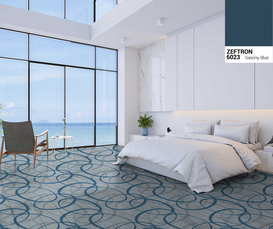
Bring in the ocean view with blue as an accent color.
Embrace the Power of Blue
Overall, blue is a versatile and powerful color that enhances the look and feel of any commercial space. Whether you’re looking to create a calming atmosphere, add a pop of color, or bring a little of the coast to your space, there are endless possibilities for incorporating this timeless color into your commercial interior design.
View all the beautiful blues in our color palettes to see how we can bring your design visions to life.
